|
For this week on Wednesday, we are able to consult with Mr Razif of our ideas and layouts. The 3 contents that we decided to use for our online project magazine are tutorial in making sushi, interview with a chef, and lastly tips in the kitchen relating with food, cleaning and more. We started our consultation with the kitchen tips by showing the inspiration for it.  Then we show our layout of our kitchen tips page.  By using this inspiration, we explained the interactivity. The tips will be the buttons where the user can read the information and the big circle can be a video. The layout of this page is simple and later approved. Next, is the interview page. We explained our earlier layout on what we want to do and place a GIF of the chef's picture. However, Mr Razif later advised to use a video and loop it instead of a GIF because the GIF file is huge. We explained that we will have a somewhat cover page before the interview page content with bits of description. Then we show the interview content layout. In this page, it will be on the same page by swiping the content like a picture gallery box to continue reading.  Top: Interview Cover Page, Bottom: Interview Content Page Mr Razif took a look of our interview content layout and told us to consider the layout content size for the written content as he said it may look small. Lastly, the tutorial page. We gave him an idea how it looks like but also we had trouble on deciding how it may look. We showed the first page of the tutorial which is the ingredient section.  Then, the show how the content of the tutorial looked like.  However, we wanted to maintain the layout from the ingredient page so we can be consistent. We wanted to maintain the page button that looks like a file and Mr Razif said we can see cook books that have the file like element. Overall, the whole idea was approved but we still need to fix and consider the layout for the tutorial page and interview page. On Thursday, we had another discussion. We start planning for the content layout for the tutorial again and managed to create few layouts. We try to be consistent and yet different for each tutorial page.  Finally, we decide the last sketch of our content tutorial on how is it going to look like.  Then, we come to our last section of our magazine, the interview page. We decide to find more inspiration on the interview page. One of the inspiration is as below:   Cite in: Behance, images by Tom Watchorn Since our interview cover page is fine, we look into the content. Ardavan and Fara thought we can also put a photo gallery inside the interview page. As for content, Ardavan thought of using the scroll down bar and have to columns to write the content but Fara and myself that it is not great to use two column and scroll bar but instead one whole scroll-able column of the article is enough. Later, we managed to solve it, instead of scrolling we swipe it like a magazine to continue the article. Since the start of the article have a picture of the chef, the next page we plan on putting an image gallery.  Fara later show some other layout example we could use for the second page interview article that have the picture gallery:  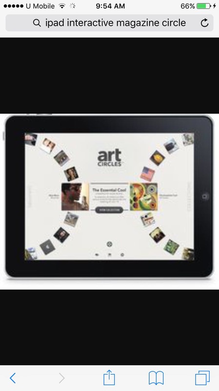  Fara later found this layout and start explaining how we can do the second page. However, for this layout in my opinion, it looks like it's more suited for tips in the kitchen section instead of the interview article. Soon, she found more suited examples and able to describe her idea:   Fara explained that on the first picture above the left side is the picture gallery and the right are the captions or a brief. Then, when the user click on the picture, the picture will become bigger and info will be there like what is shown on the next image.
0 Comments
This week, we discussed on the cover page design and the content for our online magazine. First, we discussed on what kind of content we want to put. Even though we need three sections/ articles for the magazine, we listed down more so that if one or two are not accepted, at least we have some backup ideas. The contents we discussed are:
We planned some of the content with interactivity by using videos, GIFs, animations, etc. Next, we discussed on the cover page design, table of content page and articles including animations. The cover page, we use some elements that can be seen from the previous page on Week 1. We find more ideas for our table contents by referring the images below: 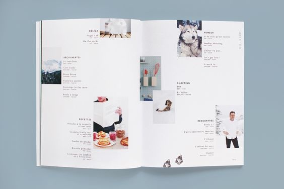 Cite from: houhouhaha.fr We draft out the design including the details of the animations:
The draft was a little cluttered, so Ardavan made a digital version of the cover and table of content pages for a better view and understanding. Cover Page:  Draft 1  Draft 2  Draft 3 Table of content:  Since we decided on Japanese themed, we decided that the font of the title on the cover page will look something like this:  As for the colour of the magazine, we decided on black, white, red and orange. On the next meeting, we discussed more on the content layout of the articles including types of media to put in. We used the image below as one part of our reference:
Before that, I even tried to find other layout for our magazine layout idea. The layout is of a concept on a online magazine, a part of it:  Cite from: https://www.behance.net/gallery/FinalCut-Online-Movie-Magazine/32625013 On the last discussion of the week, we tried to settle the contents on what to put and probably the layout. First, we already confirmed on taking a food tutorial article. We haven't decide what kind of Japanese food yet but we tried creating a layout for it. We also want to implement videos into this article. Food Tutorial Drafts:  Sub page on the top to go to next part of the tutorial  Sub page in the middle 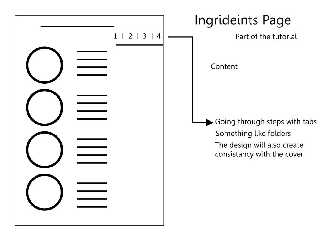 Digital version by Ardavan. Spelling "Ingredients"  Digital version by Ardavan. Then, we look into the Japanese exercises or Tabata. However, when we took a look on what is it about, it was a surprise because some of it looks similar like everyday morning warm- up exercises and so, we decided to skip it. For the counting calories article, Fara suggested an interactive pie chart. This is what she suggested: FOR THE COUNTING CALORIES,
She showed some example how can the pie chart look like and having a pull out interactivity:
Then, we have our topic on chopsticks. I suggested on writing a article about it on the principle of using chopsticks together with a tutorial using illustrations. We didn't discuss much on the tips but have an idea how the layout may look like using the inspiration below:  As for the interview article, I purpose to ask my twin sister's friend who have experience working in a Japanese restaurant. We decide on putting a GIF image of the interviewee inside the article.
Soon, we discussed more again on Whatsapp and Ardavan suggested another topic for more options, a kitchen product review. We didn't discuss much on the kitchen product review. We also tried to think what typefaces we want to use for the content of the articles. So far the suggested typefaces are Arial or Roboto. On the first week of Usability and Mobile App 2, my classmates and I were introduced to this module, an extension of the previous module from the previous semester. Mr Razif, our lecturer briefed us that it is a group project and we have to create an online magazine with interaction and a minimum of 3 sections of the selected magazine theme. In members of my group are Nurul Farahil and Ardavan Hemmat Pour. We started our discussion on deciding what magazine should we do. We thought of doing a movie magazine with the name Reel Spin or Reel. However, Fara and I discussed about the magazine content on Friday while waiting for Ardavan. We asked Mr Razif about the magazine we are thinking of doing and thus gave us feedback on the content. As Ardavan arrived, we discussed again on the magazine theme and decided on FOOD MAGAZINE, focusing on Japanese themed designs and food. This decision allow us to figure out more contents other than food recipes. Futhermore, we decided our magazine title OISHI. Soon, the three of us looked for inspiration for our magazine cover design via Pinterest and the images are as below.
Cited in: coverjunkie.tumblr.com/ Then, we search for Japanese design covers for further layout and design inspiration.
 Cited in: https://www.behance.net/gallery/26923009/SQUET-April-2015 As we look onto the designs, we look to the first magazine cover image and thought of the animation and the Japanese design elements into it. To sum it up, we have finally decided on the type of magazine, title and a rough design of the cover. |
Archives
December 2016
Categories |


 RSS Feed
