|
5th December 2017 Rebecca Tang Hui Fang (0317759) Personal Project 2: New Boundaries Lecture: Submission week Instructions: Hi all, The end of your module is in sight! Good job everyone for consistently producing work on a weekly basis and coming for your tutorials/consultations on time. I would like to brief you all on the submission requirement for your PP2 module. Final submission for PP2 on 06 December 2017 (Wednesday) @ 0900 . 1>digital work to be submitted through cd or thumbdrive Angelica, Barista, Yanlin, June, Cynthia, Jannie, Jennie, Katrina, JC, Serra and Yana. 2>physical work Casey, Dayana, Fara, Rong Jin, Daisy, Taanusha, Von Chew, Yasmin 3> physical work + digital work through cd or thumbdrive Ardavan, Michelle, Chulalak, Qhalim, Rebecca, Shukie (AR is digital for most of you except Michelle's whose brandbook is digital) ................................................................................................................................ 4> W14 post where FA should be posted (those who have physical works, better digitize it before submission) 5> Presentation video uploaded on YouTube/Vimeo and a link to it from W14 post. The above items to be graded for final assessment. Please make sure you sign your attendance as proff of your submission. Anything submitted after 9,30am will be considered late so please be on time. Will update you all on where you will be submitting your work on Wednesday morning. For now, work hard, complete your projects and make sure progressions are submitted by this Friday at 1800. ------------------------------------------------------------------------------------------------------------------------------------------ Feedback: No feedback as it is submission week. Final Outcome: A3 sized poster:  3 series of button badges:  2 series of augmented reality postcards:
Videos projected in augmented reality:
Reflection: Experience It has been a journey to go through this project even though sometimes the circumstances may not work in my favor. One is trying to figure out to maintain the transparency of the video but to no avail and Mr Razif and I could not work on together to solve the problem because of time constraint and others. Consequently, I decided to replace the video with the background from what I did earlier (see Week 10). I also need to reprint the back of the postcard when Ms Lillian messaged me about it which it wasn't a hassle. Throughout this journey, it has been a new and old experience at the same time. The thought of augmented reality is wasn't as difficult as I thought, even though it caused some problems to me. I can say that, I'm glad that managed to complete this Personal Project 2 and now I can focus more on my Final Year Project which I need to catch up on. Observation I can't maintain the transparency, therefore PNG sequences are not longer used and have to be replaced to MP4 (with BG) as there are no other video format that can maintain transparency. After that, I've made a demonstration video on the AR with the help of my sister and thank goodness that finished up the intro and most of the contents including the voice overs. With a few minor adjustments on the video and the narration, I was able to finish the final presentation video it in time. Findings It was a great journey to completing this project. Ms Lillian and Mr Razif were a big help in each at their own way. It was great working with them as it will be the last time for me till I graduate. Thank you to the both of you Ms Lillian and Mr Razif! DEPICTION OF MINE PRESENTATION VIDEO:
0 Comments
30th November 2017 Rebecca Tang Hui Fang (0317759) Personal Project 2: New Boundaries Lecture: Consultation with Ms Lillian Instructions: Hi all, The end of your module is in sight! Good job everyone for consistently producing work on a weekly basis and coming for your tutorials/consultations on time. I would like to brief you all on the submission requirement for your PP2 module. By 01 December 2017 (Friday) @1800 1> W13 post is due progress on work so far: should be finalizing (if you saw me for consultation, you can include the feedback and comments, if you didn't just post your work progress this week which would be on finalizing) & progress on making presentation video 2>make sure all weekly updates/posts are complete. This is from W4 - W13 (10 in total) 3>Ensure finalized proposal is uploaded on Google drive 4>ensure W5 - W13 folders in Google drive is archived with your weekly progression works. This will included research, sketches (digitized), work in progress weekly: basically your whole design process in weekly folders. The above four items will be graded for progression/continuous assessment. Anything after 1800 will be graded as late submission. Final submission for PP2 on 06 December 2017 (Wednesday) @ 0900 . 1>digital work to be submitted through cd or thumbdrive Angelica, Barista, Yanlin, June, Cynthia, Jannie, Jennie, Katrina, JC, Serra and Yana. 2>physical work Casey, Dayana, Fara, Rong Jin, Daisy, Taanusha, Von Chew, Yasmin 3> physical work + digital work through cd or thumbdrive Ardavan, Michelle, Chulalak, Qhalim, Rebecca, Shukie (AR is digital for most of you except Michelle's whose brandbook is digital) ................................................................................................................................ 4> W14 post where FA should be posted (those who have physical works, better digitize it before submission) 5> Presentation video uploaded on YouTube/Vimeo and a link to it from W14 post. The above items to be graded for final assessment. Please make sure you sign your attendance as proff of your submission. Anything submitted after 9,30am will be considered late so please be on time. Will update you all on where you will be submitting your work on Wednesday morning. For now, work hard, complete your projects and make sure progressions are submitted by this Friday at 1800. ------------------------------------------------------------------------------------------------------------------------------------------ Feedback: I did not meet Ms Lillian this week as it was the week where we work on our presentation video and it was optional to see her if we need this last consultation. I took the initiatives to print the final results on the collateral, setting up the AR to my device and preparing my video.
Due to some circumstances, my AR app wasn't working as it kept crashes. Reflection: Experience While the end is near and I've yet to develop my video as I was having problems with my AR in my device. It keeps crashes down and I've also consulted with Mr Razif of my problems. Later, I found out today that it was because there was too many PNG sequence in my file causing my device to exit the app immediately. While Mr Razif was occupied with other consultation, I've decided to find my own first until he is free to get back to me and also started to take pictures and record voice over for my video. I decide to leave the demo video of the AR card first until the problem is solved and can be added on my video. Observation The cause of my app to crash is because my animations that was developed through PNG sequences. Findings From Mr Razif's advice, I could try OGG/OGV format but none of the Adobe software support that output. Then, he asked me to look into chroma keying and Unity green screen whether it can solve my problem. First, I found that the chroma keying plug-ins need to buy or I can do it manually by coding. While Mr Razif said that he'll get back to me once he finish his other consultations, I decide to find and also test other alternatives. One is trying to import MOV file as AVI crashes the Unity Engine. The other option is creating alpha channel mask on after effects, like the video below which I've found earlier of the semester: 22th November 2017
Rebecca Tang Hui Fang (0317759) Personal Project 2: New Boundaries Lecture: Consultation with Ms Lillian Instructions: Good job on your collateral and the AR. Find help on exporting the AR to the device and print out the poster, postcard and button badges then work on your final video. ------------------------------------------------------------------------------------------------------------------------------------------ Feedback: With the minor adjustments for the AR, Ms Lillian commented it as it looks better now. All is needed left is exporting to the selected devices. For the badges, I told my feedback from friends and family of which they feel that the message of toxic relationship is better or stronger. Most of my respondent said they glossy attracts them first but later felt that it looked cheap and prefer the matte. Subsequently, Ms Lillian mentioned as it is because matte is trending now. From there, Ms Lillian agreed that I print the badges on matte as given from the feedback of my respondents. Reflection: Experience I'm happy with the outcome I have especially on the AR since it was my first time. It was easy with Mr Razif tutorial but then I still have to figure some parts on my own to make the AR work that I want it to look. The feedback from Ms Lillian for the past week have been very insightful and helpful especially on the graphic part of my print media. Now, I need to work on exporting my AR to my devices to know that it truly works fine. Observation In my observation on the button badges, most of my respondents were reluctant in the glossy material as a collateral. Findings From my feedback on the button badges, I asked some of my friends here in campus and some in Seremban together with my family members. Majority preferred the matte material than the glossy. While the question I asked resulted that glossy catches the eye more but later felt cheap in the end. Therefore, the respondents rather have the matte than the glossy material. For the AR, I went to several tutorial videos and the Unity website on how to export my AR to my phone or my preferred choice of device which in this case, Android. I found out that I need some SDK/NDK setup for Android, or XCode for Apple products. (Later I found out that Mr Razif do in fact have a video tutorial about it :P) 16th November 2017 Rebecca Tang Hui Fang (0317759) Personal Project 2: New Boundaries Lecture: Consultation with Ms Lillian Instructions: There no specific instructions but we are to continue with the progress on our personal project. Minor fixing on the poster and AR videos. Get feedback from people on the material of the button badges. ------------------------------------------------------------------------------------------------------------------------------------------ Feedback: This week, the overall feedback were good. All of the collateral, poster and AR postcard are coming along nicely. I've shown the poster to her on how it looks like. The texture on the background was in different colour rather than blending to the background making it visible. All I need to do is to tone down the contrast of the background or adjust it to look better. For the button badges, I managed to print in 3 types of materials:
 For texture, it didn't really go well for the design so the options are matte and glossy. I actually ask for feedback to a few of my friends on which of it was nicer and it both conclude the same results. Ms Lillian told me to get more feedback on which button badges speaks better on my topic of toxic relationship rather than my preference. I also need to solve the square box around the butterfly before I send it for actual print production. For the AR cards, I've show the test version and both videos are good but require so minor adjustments. The first AR card, Ms Lillian recommended that the title can be on top of my characters than showing in a straight middle-line title. Colour of the title was recommended to be similar as the colour of the background.   The second AR need to adjust the sentence and the colour of the typeface. Overall, everything are almost ready for the production of the project video.  Reflection: Experience I was quite happy that things are in place for this personal project. I had lots of questions regarding the printing of the button badges at Angel Printing House but it turned out great except the visibility of a box that wasn't suppose to be there. Furthermore, the selection of the art paper for my poster was hard to choose from as I want it not too hard and too flimsy but I managed to choose the right one (I think is somewhere around 127gsm-168gsm art paper). The setup of the AR was fast and easy since I'm following Mr Razif's tutorial. However, for the video part, I had to figure out myself on how to maintain the alpha channel/ transparency of the background. It took some time but it worked out in the end. Observation My observation is more on the printing of the poster and collateral. I need to decide on the materials that suit my prints and so far I made the right choice with the help of the staff from the printing house. Now, I need to figure out the type of art card for my AR postcards. Findings I tried to find ways to get a video with transparency background but mp4 does not support it and putting my avi version of the video cause of Unity Editor to crash. My first thought was exporting my videos in After Effects to png sequences thus I tried to search tutorials on doing so in Youtube and one link has been helpful to me so far: 9th November 2017 Rebecca Tang Hui Fang (0317759) Personal Project 2: New Boundaries Lecture: Consultation with Ms Lillian Instructions: There no specific instructions but we are to continue with the progress on our personal project. The videos are in coming together, finish it up and consult with Mr Razif on the AR setup. Start printing samples of poster and badges to look at the possible outcome. ------------------------------------------------------------------------------------------------------------------------------------------ Feedback: This week, the overall feedback were good. The videos for the AR are coming together nicely. Ms Lillian took a looked again on the postcard design and suggested to put background on the base itself and the AR can be transparent so that it creates an interactivity of our environment. Right now, the background in the AR makes it look flat.
Postcard base designs The first video is coming along, just need to add the speech bubbles and the introduction of the video. For the second video of the AR with the sentence, she told me to edit a bit like putting down the 'your' with the path.
Ms Lillian said everything seems coming together nicely and just need to finish it up and and consult with Mr Razif on the technical part of the AR. As for the poster and badges, I can start printing samples with the type of print/paper materials to look at the outcome. Ms Lillian advice me to take one design of the badges and print it with the choices of the type of badges that the print house I'm going have to offer. For the poster, is the matter of what time of paper materials I want to use. While we were talking about the printing collateral, I explained that I may need to remove the shapes as in was no longer an element in the animation. However, Ms Lillian told me that I still maintain it or change it to all circle because what she see and thought, is that the shapes acts as a background or light filter of an image. Reflection:
Experience So far, all progress are going smoothly. I was really happy everything is coming together for this project. Now, I just need do some minor fixing, finish and polish the AR videos up and print samples of the badges. Subsequently, I need to figure out what kind of printing for the button badges and compare the various print to suit my liking. Observation I need a few minor tweaks and testing on the video and postcard regarding on the background. What Ms Lillian said about a background may be a good suggestion as making the background of the video transparent to interact with our surroundings. Most probably look like what Pokemon Go's AR system work but with the postcard base as a marker for the AR system. Findings The places that I'm going to print will be either Mummy Design or Angel Printhouse. Those two print houses provide great quality printing but I may need to look on what they have and don't, together with the pricing. As the printing of the badges are just samples, I may consider to go to Angel Printhouse first and look into their options before I consider on Mummy Design. 2nd November 2017 Rebecca Tang Hui Fang (0317759) Personal Project 2: New Boundaries Lecture: Consultation with Ms Lillian Instructions: There no specific instructions but we are to continue with the progress on our personal project. A good job on the print collateral. Proceed with the development of the AR. ------------------------------------------------------------------------------------------------------------------------------------------ Feedback: From the previous feedback on the poster, I managed to have a better spacing and mainly the choice of typefaces. Ms Lillian was happy with the improvement I had. For the colour choice, white stands out more compared to the blue. After that, she said that the choice of serif fonts have the flakiness or thinness but also have the energy and power to describe the animation and the title. The fonts used are:
 Taking the white coloured version, Ms Lillian asked me which typeface I liked. I decided to choose either Adobe Garamond Pro or EB Garamond. Then, she recommend me to take the Adobe Garamond Pro typeface.  Next, I showed her my button badges with the choice of the typefaces above. Some of the badges worked with background and without background. So, Ms Lillian told me to choose either one and mixed them.  Moreover, the typeface for the 'Life Is...' and 'You Are...' needed to be changed and Ms Lillian told me to use the similar font I used for the poster. Lastly, I showed her my second AR postcard base and she was happy with the progress and improvement I made. From there, she told me to work with Mr Razif on the development of the AR using Vuforia and Unity.  Reflection:
Experience Fixing the space of the poster was simple but it wasn't easy to find suitable fonts for my poster and badges. However, I was glad that the choices I made for this week was better than the previous version. I managed to utilized two different comments and it was a success as both Ms Lillian and Mr Mike from my Final Project module accepted the new set of typefaces. Observation There's a lot of improvement especially on the choice of typefaces. The overall printed visual are completed and approved. Further production to the development of the augmented reality video. Findings I found that san-serif fonts may not convey my animation title in a manner that I want to show my audience. Therefore, I thought of using serif fonts instead as not only they have certain thinness but also it speaks of a certain strength, power and stability of the type of typeface. 27th October 2017 Rebecca Tang Hui Fang (0317759) Personal Project 2: New Boundaries Lecture: Consultation with Ms Lillian Instructions: There no specific instructions but we are to continue with the progress on our personal project. Poster create more canvas space, typefaces need to reconsider again and print it for rough outcome of the poster. Typefaces of the button badges similar to the poster which need to be reconsider. Start the second AR base card and AR development. ------------------------------------------------------------------------------------------------------------------------------------------ Feedback: As I show the posters with different typefaces, Ms Lillian was still uncertain with choice I have. With my explanation of reason that I want to use the fonts that I've shown her earlier, which are thin in size to show the fragility of the girl in the toxic relationship but also thicken it's strokes to have the intensity to represent strength and power. So, Ms Lillian commented that I should try and test with conventional typefaces as it may probably the best ones instead of the fancy types. Moreover, the colour of the font also need to be thought out as if I am introducing yellow as a new colour to a cold, moody situation. Ms Lillian gave an example if maybe white in colour could work. Last comment of the poster is to create more canvas space and spacing in between the typefaces. After completing these parts, I need to have a rough print for me and Ms Lillian to review in a physical copy of the poster. Next are the AR cards, I showed the base card (left) and the version of the real depiction of toxic relationship for AR. The setting of the AR assets are as shown (right). However, for the background, I will using a photographed picture and blur it.
For the second card, I did the assets for the AR. The strings will be added during the production of the AR video. For the base card, I took Ms Lillian's advise to go for a simpler outcome. And I sketched two possible scenarios.
Looking through the sketches, Ms Lillian told me to illustrate the bottom part of the first sketch instead of the whole sketch.  For the badges, similar to the poster, the typeface still need to be considered again. Overall design are good. Reflection:
Experience During my semester break to this week, I managed to work most part of my personal project. However, I have more issues on finding suitable typefaces for my title of my animation on print materials which need to be similar with the animated video. Having two opinions gave me at least an idea of the kind of typefaces but yet clashes with each other. For Ms Lillian, she sees the sense of ownership of the character in the story. Therefore, recommended me to find typefaces that have a sense of power and strength. However, Mr Micheal from my final project module, sees the fragility and distortion of the girl in the toxic relationship with the Green Girl. I still to figure out that part of my personal project which may be a challenge. Observation Typefaces is very important as it will explain the mood of toxic relationship. I have find, review and test again with the typefaces recommended by Ms Lillian. Findings I've consider on looking more serif fonts as I reviewed some of them to be suitable in describing the mood of toxic relationship with a sense of strength, seriousness and a certain little of fragility to it. 13th October 2017 Rebecca Tang Hui Fang (0317759) Personal Project 2: New Boundaries Lecture: Consultation with Ms Lillian Instructions: There no specific instructions but we are to continue with the progress on our personal project. ------------------------------------------------------------------------------------------------------------------------------------------ Feedback: This week, I showed better sketches of my ideas and amendments I want to do on my AR postcards. For the contents of the AR cards, I explained again for the first card especially on the augmented reality side of it and explained the new idea for my second AR card.
Ms Lillian accepted the contents of the first card but for the second card, she gave feedback on the print base. The AR of the second card is acceptable but the content of the base was complex and the dialogue of the people are too fine-line and not clear in describing toxic relationship or the AR video itself. She gave her perceptive of toxic relationship on family as she describe that parents sometimes control their teens' future is because they still treat them as children then teenagers or young adults as they still need guidance from their parents. Another reason is that some children need the guidance and the push from their parents. In the friendship content, it was still not clear as a toxic relationship because, one even a friend disagree on something and feel like the other is not supporting, it doesn't mean it's toxic. Ms Lillian said that the second card is too complicated, and I have to rethink and minimize the print contents. Overall, I can proceed in producing the first card and the assets for the AR, plus Ms Lillian recommend me not to use background and just colour the characters and concept. For the designs of the button badges, the sketches are as below:
As we took a look on the badge design, the typography designs (#3 and #5) are out as they are confusing especially #3 and not so appealing. Ms Lillian liked the idea of badges #2, #6 and #8. For badge #6, she said I may need to test the overlapping and the positioning of the image with the typeface. Badge #8 which shows the overlapping speech bubbles creates an idea of some sort of argument but the positioning of the tagline 'Life is Mine' creates confusion. Ms Lillian suggested to take out the taglines on it and leave the word 'Mine'. Overall, these 3 designs are accepted and suggested not to put any background. Ms Lillian commented on the poster that she liked the dynamics and composition of the characters. Still, there's some things I need to adjust. Ms Lillian said that I need more space, a canvas type of spacing where all the sides of the poster are in equal distance between the content and edge of the paper. She said that I can make the Green Girl slightly smaller to create more distance and the butterfly can be closer to the hand or some sort.  Moreover, I really need to rethink especially on my choice of typefaces. With the title 'Mine', I need fonts that describes power, strength and firmness of the message. Ms Lillian advised me to look into Studio Ghibli's posters. To see their usage of fonts as she described that my art style have some sort of influences from both cartoons and anime, and that Studio Ghibli have that kind of feel to it. Reflection: Experience For this week, I managed to get more ideas and made some improvement from the previous sketches. However, I still need to think simpler for my second AR card especially on the reality of toxic relationship. Ms Lillian really gave me insights and perspectives of friends and parents. Thus, I need to think again and in this case, simpler as the content of the print is too complex. The design ideas of the button badges has improved and I'm glad that I got the feedback I need. As for the poster, I had trouble on the choice of my title's typefaces. Ms Lillian gave me a suggestion that I should use fonts that represent power, authority, strength, etc instead of thin and flaky. Her suggestion finally make me see the content and message of my animation and it was what I needed to know in progressing not only my personal project but also my final project. Observation There are much improvement in generating ideas for the AR postcards and button badges. The second AR card will need to be review again for the print content and have to be understandable and not too complicated. The button badges may need to test out with colours and the suitable typefaces that also go with the poster. The animation poster just needed so adjustments to create equal and balanced spacing. Findings Research were made again for the AR cards to get the idea of the conversation in a toxic relationship but I still need more understanding and a different perspective for the second card. The looked into other button badges for inspiration and having typography designs doesn't look appealing and it was also confusing. Instead, combination of important elements of the animation and layout of the typography works better but need further experimentation on the positioning of the title or tagline. Examples are as below:
I looked into the content that I can place for my poster. The contents are short and only describe the person who created the animation and the title of the animation. Examples are as below:
5th October 2017 Rebecca Tang Hui Fang (0317759) Personal Project 2: New Boundaries Lecture: Consultation with Ms Lillian Instructions: There no specific instructions but we are to continue with the progress on our personal project. ------------------------------------------------------------------------------------------------------------------------------------------ Feedback: From the sketches and the poster, Ms Lillian gave a lot of feedback for me to think about. First, I've shown her the illustrated poster and explained that I still need to think about the font/typeface since my Final Project animation needs to have similar font on my opening title. Ms Lilian also told me to think of what other things I need to place on the poster.  Then, I show her the sketches of my AR cards and explained what is going to be on the base card and AR. She commented while the first one has an illustration of the animation and the real meaning of toxic relationship through AR, she said I may not need to make something similar again. She explained whether people really need download the AR app or use the devices provided to see both the meaning of the metaphors in toxic relationship which sounds a little hassle. Instead the second card can be a reversed of the first. The second card can be the real life depiction while the AR video can be the metaphor. With this idea, the audience can get a look of two reality on the base card and those will reflect what is in the AR. Lastly, I show her my badges. The show her the outcomes of the 3 series I did. However, she commented that I used too much on my characters on promoting my final year project. When she saw the other sketches of the first two in the first and second series, she commented that it was interesting and has dynamics compare the one I did above. She took noticed of one my sketches that it could work.  Nonetheless, she told me that may have to think more instead of the ones I did completely and in the sketches. She also said I too fast without showing any other progression and that I wanted to locked down everything. She advised me again that this personal project is equally as important as my FYP and I should try to slow down and think more. Reflection:
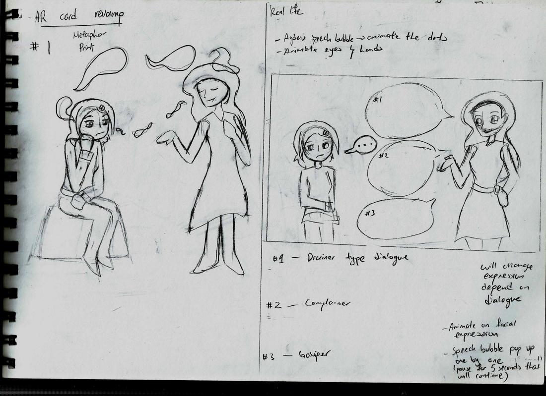
Experience For this consultation, I learnt that I need to slow down and think more creatively for my project. From what Ms Lillian said, I'm taking this personal project as a side project and just want it to get over with which it's true as I wanted to focus more on my animation project. I was too inside the box and focus on too much on other things which lead me with limited ideas. Therefore, I need to take a step at a time to make more progress and ideas for this project. Observation I need to rethink my ideas and creative approach of my AR cards and button badges. Findings I may need to look into typography as a creative approach for my button badges other than focusing to much on the characters. Also, I need to reconsider the important element of the subject and implement on how and what I can do. 28th September 2017 Rebecca Tang Hui Fang (0317759) Personal Project 2: New Boundaries Project Proposal Lecture: No lecture for today as Ms Lillian was unavailable. Instructions: Firm up the proposal by this week (Week 5) so that individually, you will be clear on what to achieve on your Personal Projects on a weekly basis. Week 5 post is due this Friday 29th SEPTEMBER 2017 at 6.00p.m. Create individual folders in your respective folders for each weekly progress (ie. Week 5 Progress in folder called WEEK 5). What you chose to update with will depend on yourselves individually and should be guided by your own project management and weekly planning. -------------------------------------------------------------------------------------------------------------------------------------------------------------------------------------------------- For this week, I started on my poster and did some rough sketches of my ideas for the AR postcard and the badges. The animation poster, I had a rough draft for my concept art from my Final Project of how it going to look like. There, I started to develop the poster from line art to colour with the same style I'm going to use for my animation and continue amending it. The result are as below:  Continuing on working the poster, I realized I need to change my poster from RGB to CMYK. The rough results are as below:  This is a PNG image as JPG image for CMYK format is not compatible. If possible, I may need to work on the colour mode especially on the Green Girl that best represent my concept of story. For the postcard, I split in two to compare and contrast on my storyline and the real depiction of toxic relationship. The first postcard design, I did some more research and came up with the idea that best describe my metaphors like the drainer, complainer and gossiper. I have two choices on the base card as the situation is almost similar to each other. For the motion animation video, I had a rough idea on parts to animate. The dialogue has yet to be established for the first video.  Series 1 of AR postcard For the second postcard, I did two types of scenario. The first idea was the Green Girl controlling Ayden and how I depict it in our reality. In this rough sketch, I decide to use the 'discounter' in a relationship where the toxic person has a strong need to be right and challenges every word you say. In my opinion the definition of the 'discounter' sounds similar to manipulation of emotions.  Series 2 of AR postcard, Part 1 As for the second idea, I thought of taking the falling action of the story where Ayden is free from the control of the Green Girl. In my depiction of it, Ayden decided she had enough and end her relationship with her friend as it cause so much pain, frustration and uneasiness whenever she around.  Series 2 of AR postcard, Part 2 After that, I did some rough sketches for my badges too. There are 3 series of badges. The first and second badge displays the characters while the last badge displays the title of the animation and other elements of the animation. The reason of the title 'Mine' is to bring questions of toxic relationship whether the victim belongs to the toxic person or the victim is her own life to choose. Therefore, I created taglines 'You are Mine' and 'Life is Mine' (reference to RWBY, Life is Mine :p).  Series 1 and 2 of badges, showcasing the characters  Series 3 badge, showcasing the title Feedback:
................. Reflection: Experience Even there wasn't any class, I was able to work on my personal project despite I was in a rush and busy with other projects. First of, changing the concept definition of my project. Since most of my understanding of concept is not clear and have to read again and change my explanation on my concept. Another misunderstanding is the weekly plan, I thought it was an ongoing update on actual time frame instead it's an estimation of what I'm suppose to do during throughout the weeks ahead from what I observe from one of my friend. I managed to get down my rough ideas in time and look up more into the type of person in toxic relationship or friendship. The conceptual idea of the poster was done earlier but it needed some amendments to fit in A3 and also some colour correcting and line adjustments to the characters. Moreover, it also the best way as reference to continue the rest of the print media with the similar mood. Overall sketching through these ideas, I find myself reflecting so much from my past self and among other people. It made it realized that I too starting too change for the better. Observation From my proposal, I need to understand the clear meaning of concept and the actual purpose of weekly plan which is not an update report. In my observation of my work this week, it felt rush it a way that I needed to put more time in my sketches if case I missed any details that are important. In addition, I should have thought of the printing format earlier before I finished my poster. Consequently, I may have to adjust the colours especially on the Green Girl, if it's possible to get the colour close to the original. For the tagline of the second badge, I find it difficult in terms of length and proper grammar until I found a suitable saying, 'Life is Mine'. Findings While looking for ideas on the AR card, I found a simple explanation of the types of toxic relationship I'm looking for. Through it, I managed to roughly illustrate the real depiction of the relationship. As for the button badges, I took time in thinking and looking for taglines that suit for the main character which is on the second series of the badge. I wanted to make a contrast of both characters and the reason the title 'Mine'. It's was simple in coming up 'You are Mine', indicating the Green Girl/ toxic friend have more control on the main character which also create a sense of ownership. For the Ayden, the main character, I wanted to indicate that she has control of her choices and dreams in life. Therefore, I found a suitable tagline that speaks clearly which is 'Life is Mine', also a reference from RWBY's soundtrack title. |
AuthorWrite something about yourself. No need to be fancy, just an overview. ArchivesCategories |


 RSS Feed
